Within the UX community, creating and using dark patterns is considered unethical. Instead, designers should focus on creating transparency with the users in mind instead of manipulating them.
An example
Dark patterns have been around for a long time and are not limited to websites. Unfortunately, they're complex and sneaky, making them sometimes hard to spot.
Let's look at the following example.
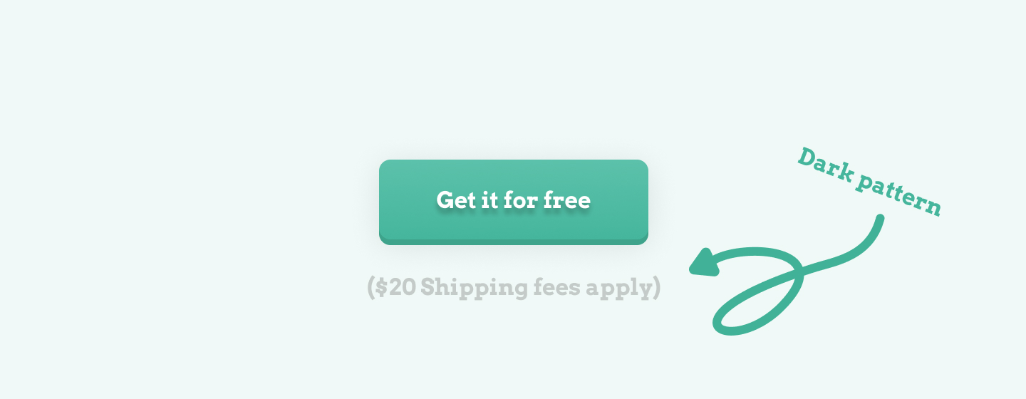
The resource or product in the image above appears to be free. That's because the design makes you focus on the large text that says so.
However, the shipment costs still need to be paid by the customer. This is only written below the main text using a very small font with a color that is almost impossible to read due to the low contrast ratio with the background color.
How do dark patterns work?
Dark patterns in UX take advantage of how users process content. For example, it is well-known that most users don't read text. Instead, they scan it.
When people skim over text, they rely on previous experience and visual cues to guide them. That's why text in all caps is harder to read than non-capitalized text, by the way.
Most people rely on the businesses they visit to create a product with their best interests in mind. However, this does not always happen. These flaws give companies and designers opportunities to deceive users and take advantage of the situation. And that's where the dark pattern comes in.
Why you should not use it
You should avoid using dark patterns for two reasons. First, using dark patterns in your product can lower customer trust once, which may reduce the size of your user base, decreasing business profit.
By providing customers with an experience that has their interests in mind, you do the exact opposite of a dark pattern.
The second reason why you shouldn't use dark patterns as a UX designer is that the community frowns upon dark patterns. It might just hurt your chances on the job market later on.
Common dark patterns
Now that you know what a dark pattern is, it is time to look at some commonly used dark patterns in UX.
Roach Motel
The 'roach motel' dark pattern is used for services that are easy to sign up for but very difficult to cancel. Well-known examples include newsletters that are almost impossible to cancel.
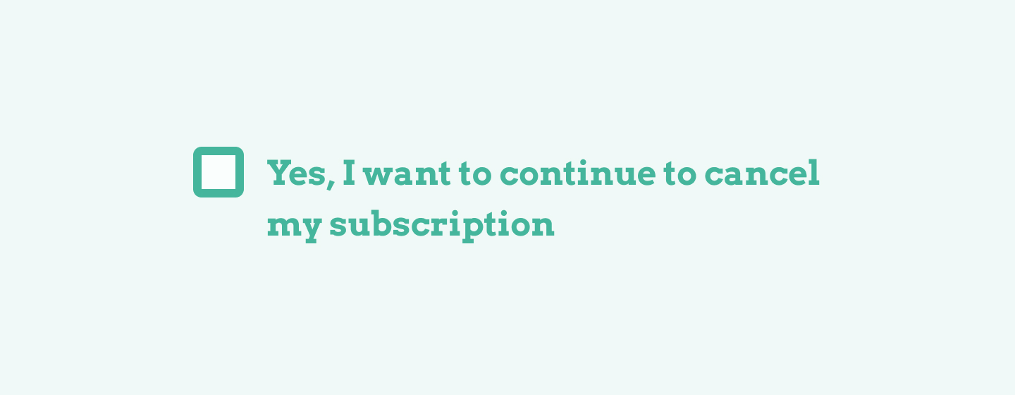
The unsubscribe button is hidden at the end of the newsletter in a very small font and usually has a very unclear label that's confusing for the user.
Hidden costs
Hidden costs are hidden until the client nearly completes a purchase. By waiting until the last moment to reveal these costs, designers hope that the user is invested enough to take these extra costs for granted.
Most of the time, these costs include shipping fees and service fees.
Interface interference
The interface interference dark pattern is used to design an interface that prioritizes unwanted actions. These actions usually are more expensive for the user.
For example, a train ticket service that provides users with the following buttons:
The primary action button for selecting a more expensive train seat.
A secondary button for continuing without spending more on the expensive seat.
Useful resources
The Danger of Dark Patterns - Toptal
What Are Dark Patterns in UX Design - CareerFoundry
An Dark patterns in UX: how designers should be responsible for their actions - UX Collective
Share
×Twitter
Page link
https://www.uxdictionary.io/dark-patterns
Copy