As a UX designer, designing well-designed buttons is essential for creating a positive user experience. Style them to grab the users' attention and help drive them in a particular direction.
Buttons tend to look simple, but there are several principles and rules that you need to keep in mind if you want to design effective and efficient buttons. Buttons should, for example, clearly indicate the action they allow the user to complete. But more on that later.
How to create the perfect button
As a UI and UX designer, you need to be able to design good buttons. Here's an overview of what to keep in mind.
Identifiable
Buttons should communicate an action to users, and appear interactive, no matter the device you use. However, unlike physical buttons, it's up to you as a UI and UX designer to provide significant affordances to help users understand that something is clickable.
The factors that help make buttons identifiable are their shape and size. The shape of a button has changed a lot over the years and depends on current design trends, but the most popular shape is a rectangle with sharp or rounded corners.
The size helps both the findability and the interaction of a button. Icon buttons should be at least 24 by 24px. If you're designing a button with a label, add at least 8px of padding around the microcopy to increase the button size.
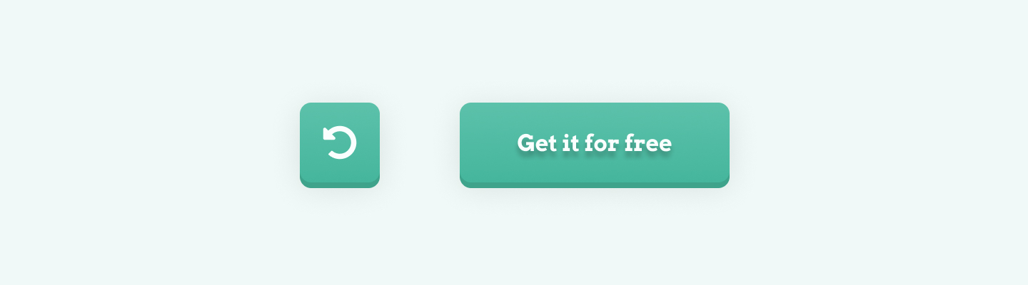
The image above shows buttons that follow best practices in size and padding.
Findable
Buttons must be easy for users to find. To make a button more discoverable, place it where users expect to see it. It's also important to be consistent across the site or app with the placement of the business.
Users expect buttons at the end of forms, hero sections, footers, and the top right of a navigation bar.
Clear
The user should always know what action they are taking before clicking the button. Apply the following tips and tricks to make a button clear.
Colors have specific meanings. Use color conventions to make it easier for users to understand the action behind a button.
Use microcopy to describe what a button does. Keep the label to one line as much as possible.
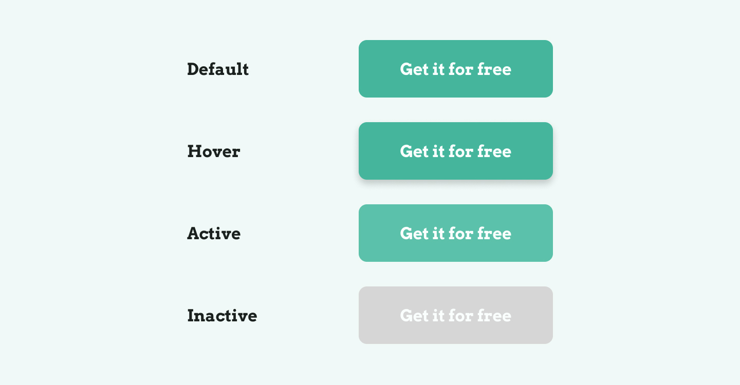
Button states
Each button you design can have different states. When you work on buttons for a project or a design system, create a design for each button state.
The default button state appears when there's no interaction with the button.
When you hover the button, show the hover state of a button. You could, for example, highlight the color or show a drop shadow on hover.
Use the active button state when a user clicks or holds the button.
When a button is disabled, it is likely to have a low-contrast color fill. This button state is called the inactive or disabled state.
Button types
We already discussed different button types with the icon and labeled buttons. Let's take a closer look at some button types you can use and design in your projects.
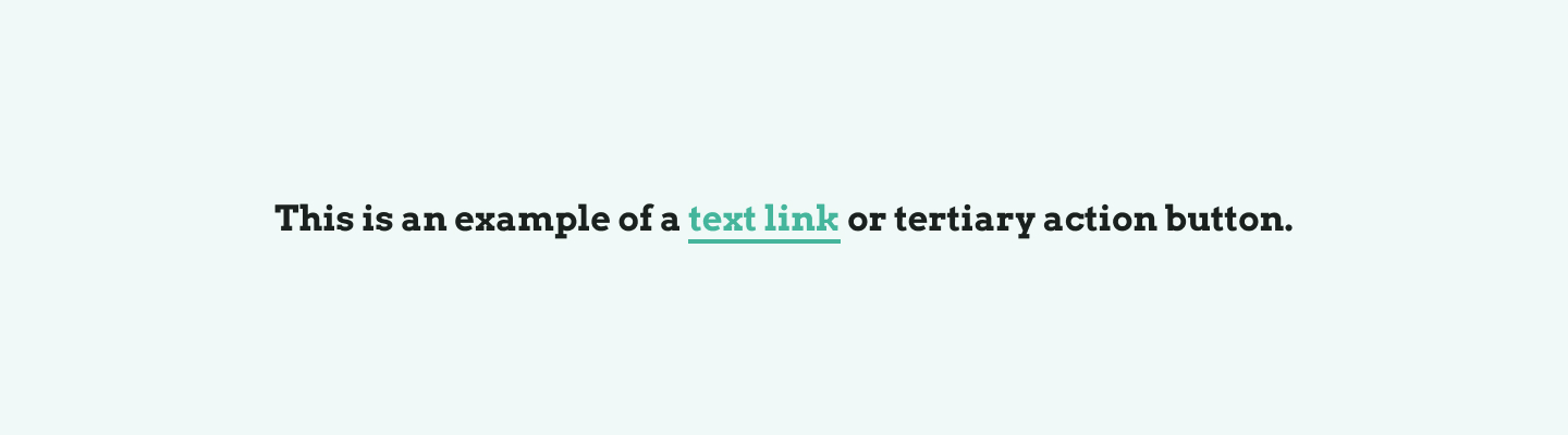
Text
Text buttons are text labels that describe an action. Because they look a lot like regular body text, text buttons don't stand out. They're likely not used to indicate the primary action of a page and do not distract users from nearby content.
Text buttons are also known as tertiary action buttons.
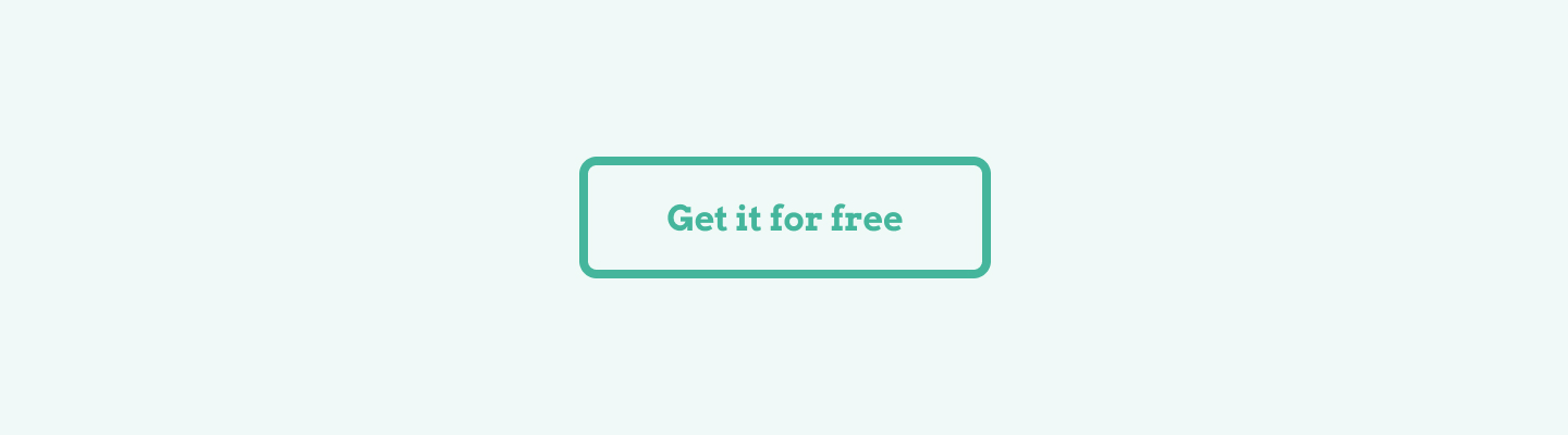
Ghost
Ghost buttons, also known as outlined or secondary action buttons, indicate an important user action. They usually are placed next to the primary CTA of the page.
Ghost buttons have no fill. Instead, they have a border fill that follows the main accent color of your design.
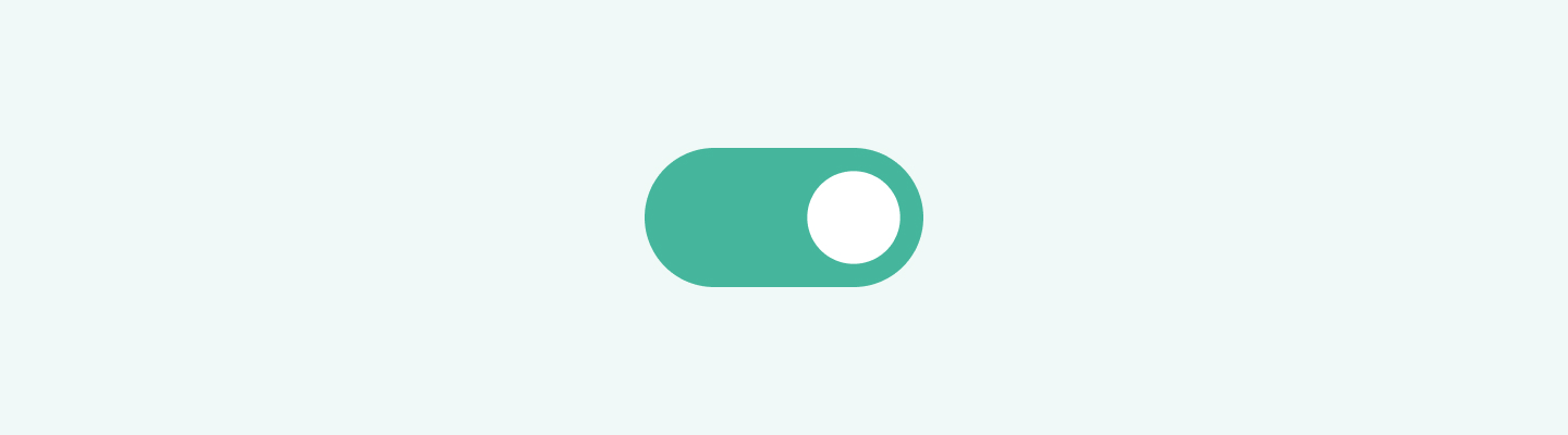
Toggle
Toggle buttons are special buttons that have two states. These buttons can be on and off. You can use these buttons to change the settings of an application.
Floating action button
A floating action button is the primary action on a mobile screen, and it's usually related to a constructive action, like starting a new chat or e-mail.
The floating action button is part of the Material Design system. You'll likely encounter the button on Android devices or Google apps.
Share
×Twitter
Page link
https://www.uxdictionary.io/button
Copy